Sail Sand Point
Sail Sand Point is a non-profit community boating center located in Magnuson Park, Seattle. SSP’s mission centers on making boating accessible to everyone, regardless of financial and physical differences.
Finding a Design Crew
At the close of SVC’s User Interface Certificate Program Capstone, SSP hired one of my very talented classmates to expand his redesign concept to their entire website.

Original design concept for Sail Sand Point’s website redesign. Courtesy of Jon Wood.
There was one problem - he’d landed a full-time UI position shortly after our program wrapped up and was not able to take on the project.
With an introduction from my classmate, I won the contract with Sail Sand Point to expand his design concept to their entire website.
My Roles
Visual Design
Applied the design concept to the entirety of SSP’s content, building and streamlining the design system along the way.
UX Design
Refined the information architecture of the site to create a more intuitive structure.
Logo Design
Designed a new logo to unite SSP’s long-standing brand recognition with their refreshed visual identity.
Sail Sand Point had a great solution

Original SSP website redesign. Courtesy of Jon Wood.
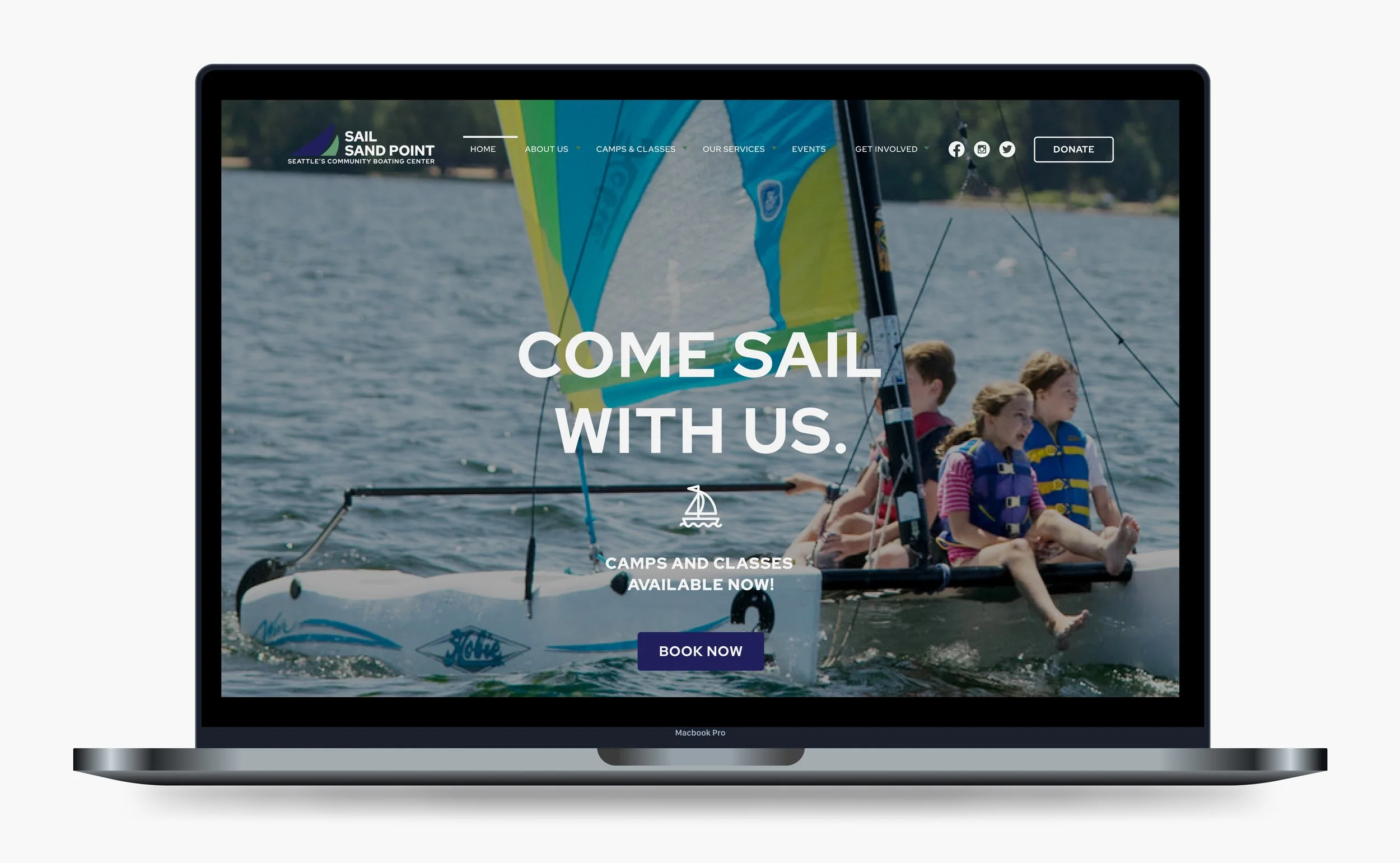
Visually, the redesign was clean, modern, and approachable.
The information architecture was well considered and made SSP’s most important content - information about sailing camps and classes - easy to find and easy to digest.
But there was A LOT of content to fit into this new framework.
Making It Work
The original design concept focused on three pages of the site, which left a fair amount of content to manage.

Final website pages
As I worked through each page of SSP’s website, opportunities to streamline the design arose.
I simplified the type hierarchy, iconography, and color usage throughout the site.
I accounted for every little bit of content on SSP’s site, simplifying long paragraphs and adding imagery to make the information easier to digest.
Stakeholders were particularly concerned with sharing accurate, comprehensive information about camps and classes.
I integrated session dates into each class listing and situated program guides where they are most relevant.

Youth Camps Section of SSP’s website
Logo Design

Sail Sand Point redesigned logo, palette, and mood. Courtesy of Jon Wood.
Sail Sand Point loved the color palette and typography of their refreshed brand expression.
However, stakeholders were apprehensive about making a drastic change to their logo.
Working with feedback from employees and the executive director, we found our way to a subtle update of SSP’s logo to bridge the gap between their fresh new look and the brand recognition they’ve earned over their 24 years of operations.

Redesigned Logo
Sailing On
Key stakeholders are pleased with the site’s visual and architectural updates.
SSP’s redesigned site is modern and streamlined, and clearly and quickly shares its mission and values with the user.
The site overall feels more welcoming, with high-value information, such as camp and class descriptions and availability, very easy to find.
Currently, the new site is in development and testing.